Overview
This user guide will explain how to use the map, and how to interpret the different sections. The map itself can be reached by clicking on the Map tab in the header.
There are two parts to this visualisation: the map in the main window, and the graph in the sidebar to the right.
Data
There are also two types of data: factors that would be expected to support communities and indicators of need in those communities.
You select support and need measures in the sidebar. You can change the selected measures to answer different questions.
The measures you select are plotted on the graph, each circle corresponding to an area. How many circles there are depends on how fine-grained the data are for that measure (and how many areas the map will be divided into).
Descriptions of the measures can be found in the project's Open Science Framework repository.
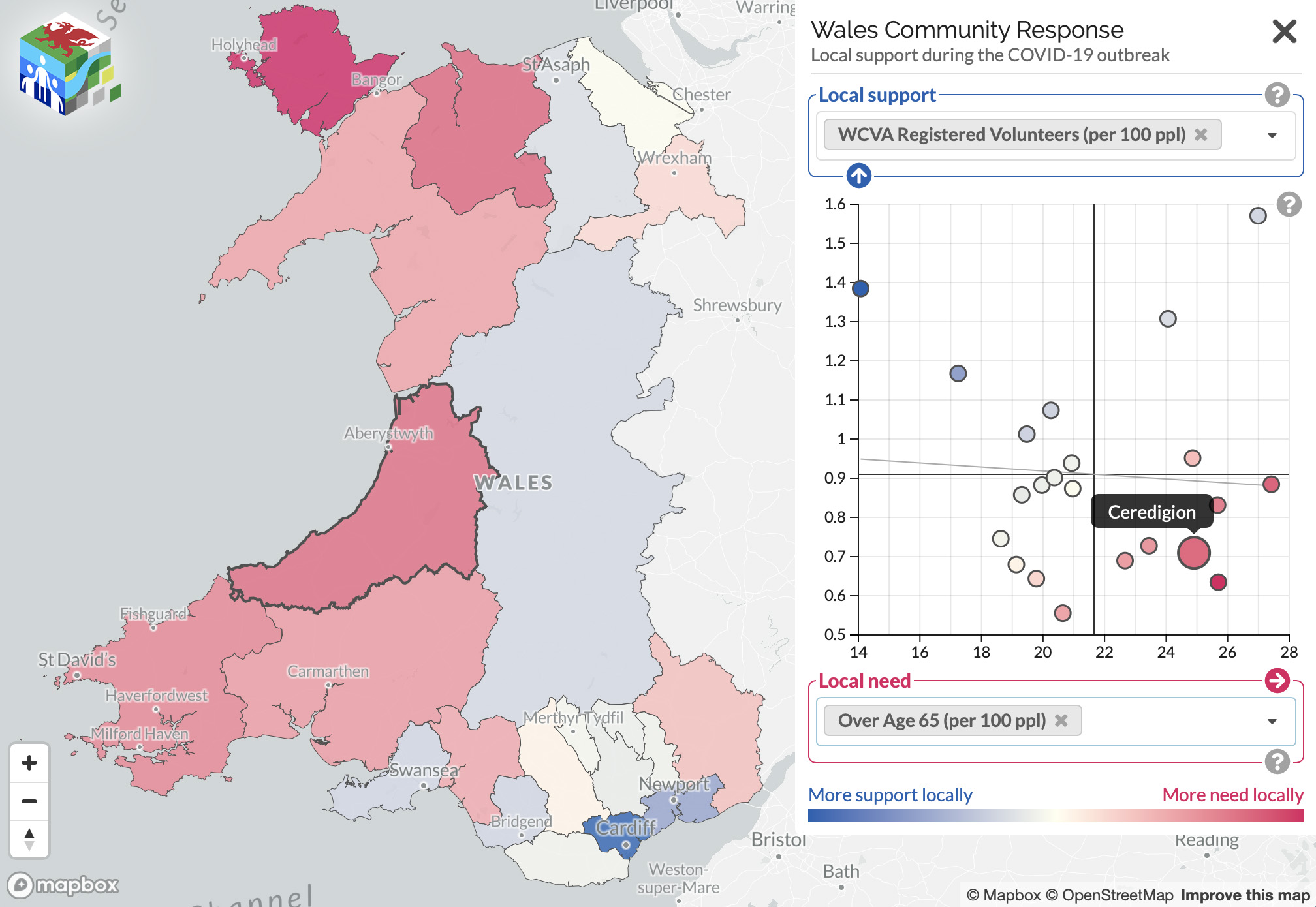
Single measure
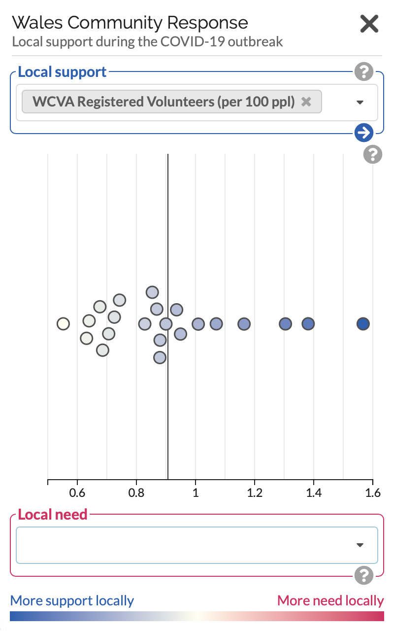
If you select one measure from the drop-down list, the graph shows how that measure varies between different areas, from low on the left to high on the right. The line shows the average (mean) value of that measure. Here we have selected the number of registered volunteers per 100 people.
More intense colours reflect greater values of that measure. More support is always blue; more need is always red.
The same colours are applied to the map.
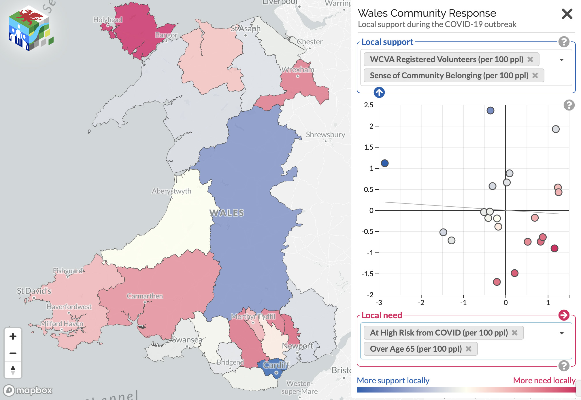
Two measures
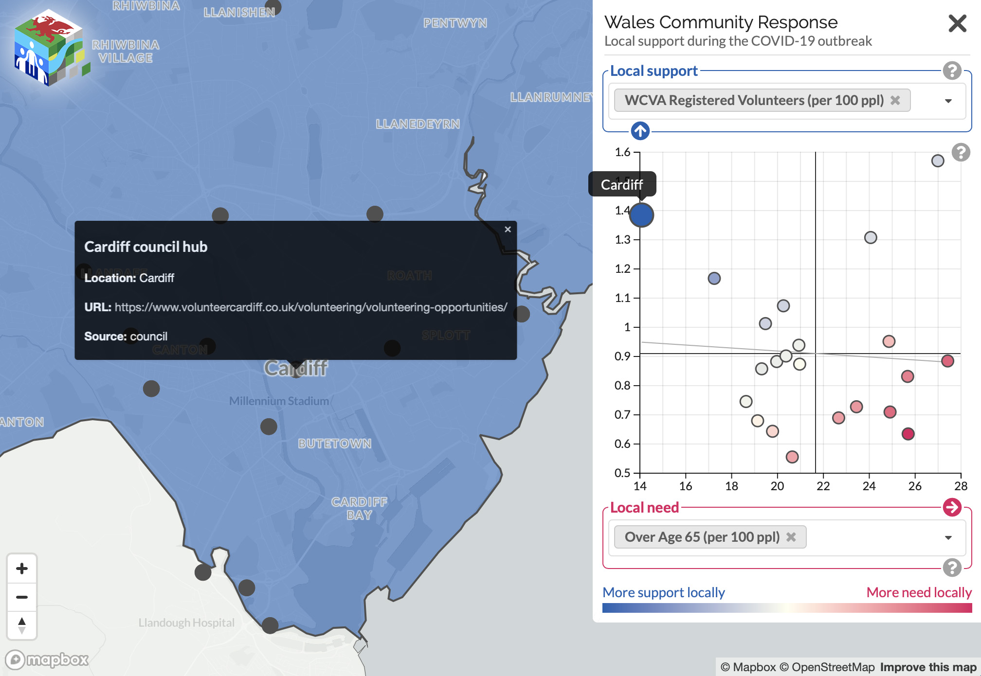
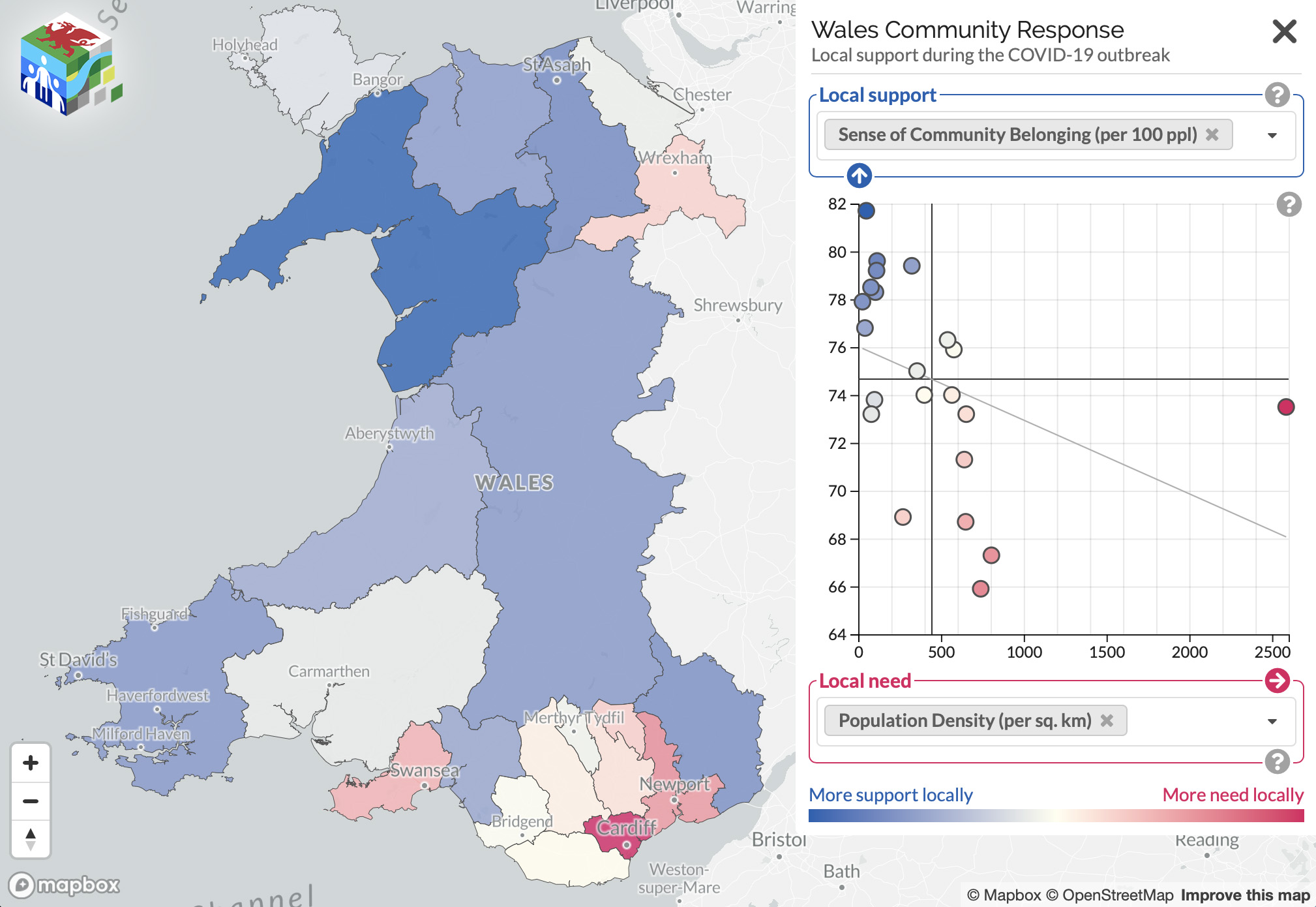
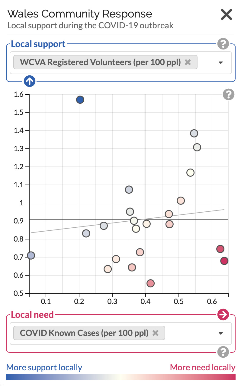
If you add one support measure and one need measure, they are plotted against each other, with need on the horizontal axis and support on the vertical axis. Here we have selected the number of registered volunteers per 100 people as the support measure, and the number of known cases of COVID-19 per 100 people as the need measure.
The bottom right of the graph reflects areas with high need and low support, while the top left reflects areas with low need and high support.
So areas near the bottom right of the graph appear the most intense red, while those near the top left appear the most intense blue.
The grey diagonal line on the graph shows the trend in how the two measures are related. A line from low left to high right implies that as one increases, the other also increases; a line from high right to low left implies that as one increases, the other decreases.
Map colours
This translates onto the map. More intensely red areas are those with more need, while more intensely blue areas are those with more support, as defined by the measures you have selected in the sidebar.
Combining measures
You can also combine more than one support measure to make a combined support measure. Just add another support measure from the drop-down list. You can do the same for need measures.
The measures are added together with equal weights. These combined measures are scaled as Z-scores, showing how an area’s value relates to the average value across all areas (the mean). Positive Z-scores are above the mean, while negative scores lie below the mean.
Of course, not all combinations of measures will make sense, so bear that in mind when choosing.
The combined measures are provided at the highest resolution available to all the measures that make up the combined score.
Interacting with the map
For help, click the question mark button in the corner of the section you would like to understand more about.
You can close the sidebar by clicking the × in the top right corner of the screen, or open it by clicking the + (visible when the sidebar is closed).
On the map itself, hovering over an area will show where that area appears in the sidebar graph.
Panning and zooming
You can pan to different areas of the map by dragging, or zoom for a more detailed view by scrolling or using the controls in the bottom left of the screen.
Zooming into the map will reveal points corresponding to community support groups. Clicking on one of these points will bring up information about the group.